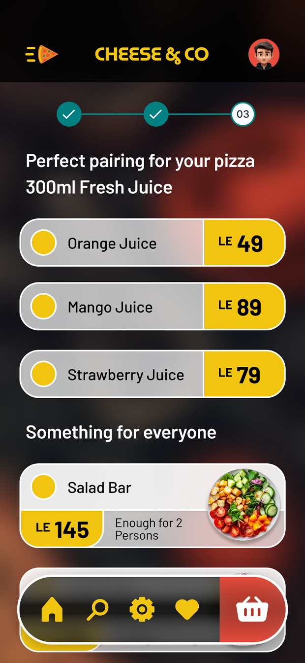
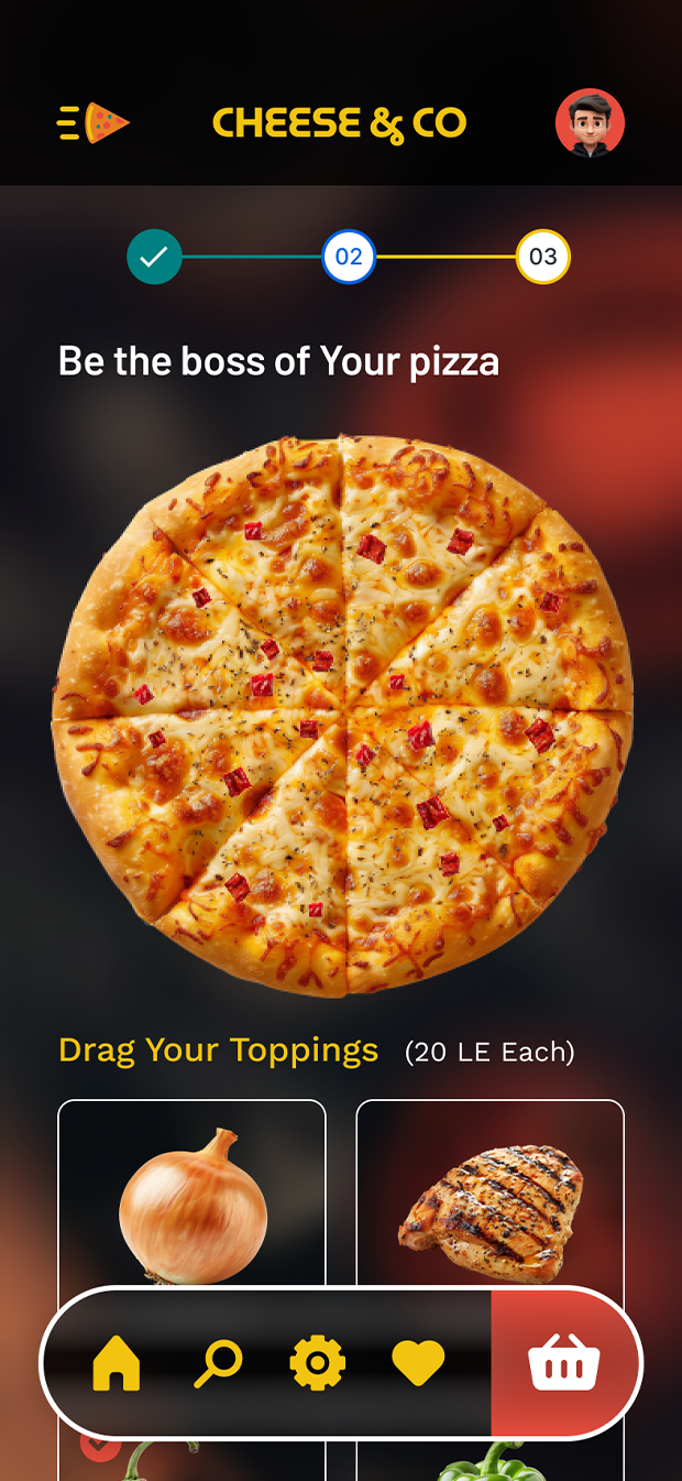
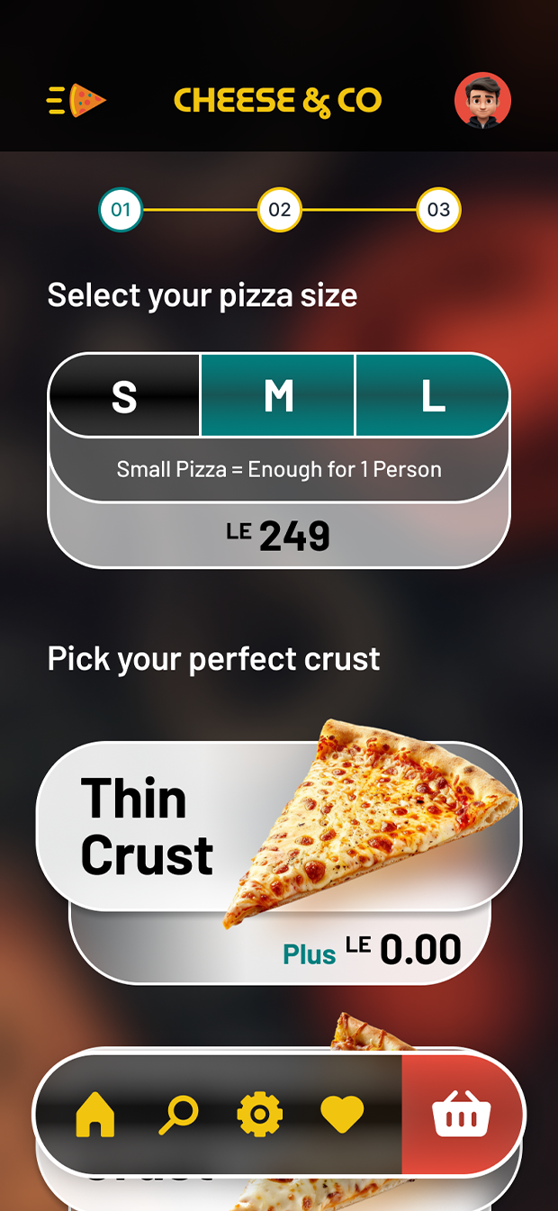
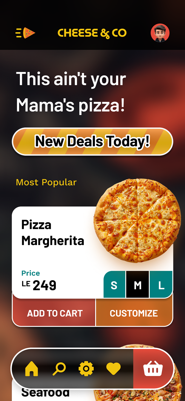
A showcase for an UI design process for Cheese & Co, a pizza ordering app. My focus was on creating an intuitive, visually appealing, and brand-aligned experience that makes ordering delicious pizza a breeze.
The design goal was to enhance visual appeal and interactivity


Spicy Delight Palette: Rationale and Goals
The Spicy Delight palette is a fiery and vibrant selection designed to evoke a sense of excitement and adventure for those who crave pizzas with a kick. Here's a breakdown of the reasoning behind each color choice:
Primary Colors:
- Fiery Red: This is the hero color, representing the heat and spice that defines the "Spicy Delight" theme. It grabs attention and stimulates the appetite while hinting at the boldness of the pizzas.
- Orange: This warm, energetic color complements the red and adds a touch of playfulness. It can suggest the vibrant color of chili peppers or hot sauce.
Secondary Colors:
- Deep Yellow: This rich yellow hints at the golden color of melted cheese, adding a sense of balance and grounding to the fiery red and orange.
- Black: A classic and versatile color, black provides contrast and sophistication. It can represent the char on a perfectly cooked pizza or the dark color of certain spicy ingredients.
Color Psychology:
- Heat and Spice: Red and orange naturally evoke a sense of warmth, intensity, and even a touch of danger, perfectly aligning with the "Spicy Delight" theme.
- Energy and Excitement: The bright and bold tones create a sense of energy and excitement, appealing to adventurous pizza lovers who crave bolder flavors.
- Balance and Contrast: The inclusion of black and deep yellow provides contrast and grounding, preventing the overall palette from being overwhelming.
Brand Identity:
- The palette reinforces the concept of spicy pizzas offered by this brand. The fiery colors visually represent the experience of enjoying a hot and flavorful pizza.
- It communicates a sense of boldness and confidence, appealing to customers who seek unique and exciting flavor combinations.
